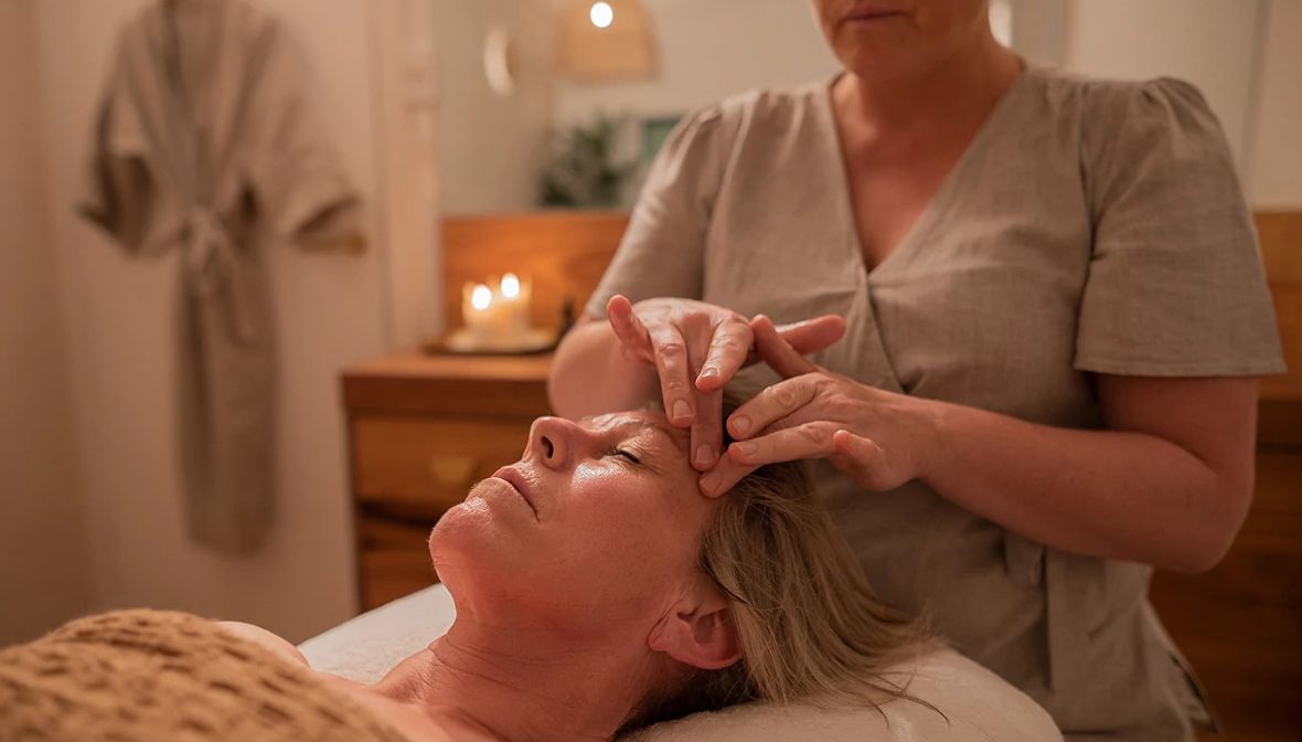
Javascript is not enabled.

Javascript must be enabled to use this site. Please enable Javascript in your browser and try again.

Skip to content
Content starts here
CLOSE ×

Search

Leaving AARP.org Website

You are now leaving AARP.org and going to a website that is not operated by AARP. A different privacy policy and terms of service will apply.

Try an Easy Spring Refresh With 2022 Colors of the Year

New hues reinvigorate living spaces, decor and mood

spinner image a kitchen with walls painted in a purple color called very peri pantones color of the year for twenty twenty two
Jacek Kadaj / Getty Images

One of the easiest, least expensive ways to give your home a makeover is through the use of color.

After spending an inordinate amount of time at home for the last two pandemic years, many people are ready for a change that will boost their moods and perk up their living spaces.

spinner image Image Alt Attribute

AARP Membership— $12 for your first year when you sign up for Automatic Renewal

Get instant access to members-only products and hundreds of discounts, a free second membership, and a subscription to AARP the Magazine.

Join Now

Beige is now boring. The 2022 colors of the year, chosen by paint companies, design organizations and international color forecaster the Pantone Color Institute, run the gamut from verdant shades of green to periwinkle.

The pandemic has done more than just inspire a desire to change the color of the walls; it also impacted the hues people are drawn to and how they want their homes to feel, according to Kristen Siefkin, founder of Interior Design Alchemy.

“Since the beginning of the pandemic, my clients have a greater appreciation for the comfort and safety of their home environments,” Siefkin says. “We are all naturally gravitating toward softer palettes that create an atmosphere of respite and restoration and colors that are comforting, natural and refreshing.”

Redecorate with lively shades

One of the colors that creates that feeling? Green.

Almost all of the 2022 “colors of the year” are verdant shades: Benjamin Moore chose October Mist, a soft, silver-green; Glidden picked Guacamole, a fresh shade of avocado, PPG went with Olive Sprig and Behr opted for a blue-green shade called Breezeway.

“Given that many people are spending more time at home than ever before — and  spending it with fewer people — the desire to incorporate the tranquil and harmonizing effect of green is logical,” Siefkin says.    

There were a few outliers: HGTV Home selected a shade of faded blue called Aleutian and Dunn-Edwards went with Art and Craft, a soft brown hue. Instead of choosing a single color, Valspar opted for a 12-hue palette that included Lilac Lane, Subtle Peach and Gilded Linen. 

The Pantone Color Institute also deviated from the green palette and chose Veri Peri, a shade of periwinkle, as its 2022 Color of the Year. It’s the first time the international color forecaster has created a brand-new color. (In previous years, Pantone has selected a Color of the Year from its existing Pantone Color System).

“We’ve been drawn to natural colors lately, which you can see from the other Color of the Year recommendations [that are] in the green, teal and blue families,”  says color expert Amy Wax, past president of the National Association of Color Consultants. “Veri Peri, a periwinkle blue, takes that direction and adds life by giving you an option that is fresh and uplifting.”

Health & Wellness

Target Optical

50% off additional pairs of eyeglasses and $10 off eyewear and contacts

See more Health & Wellness offers >

Wax notes that even the outliers are nature-inspired, organic colors that create a sense of warmth and comfort in a space.

Adding hues in creative ways

spinner image four images of different green paint companies twenty twenty two paint color picks in rooms of a house
Courtesy Behr; Courtesy PPG. Bottom row: Courtesy Glidden, Courtesy Benjamin Moore

Bringing in new and unexpected colors to your living space can mean painting a wall or incorporating a pop with pillows, drapes or accessories. The lively Veri Peri works “brilliantly” with neutral colors from gray to greige and tan to white, Wax says. She suggests using periwinkle “alongside quieter colors to give it the chance to stand out.”

When it comes to incorporating the green hues chosen as colors of the year into your home, Wax suggests viewing the soothing shades as neutrals and pairing them with colors across the spectrum from cream and light gray to orange and plum.

Shades like Olive Sprig, Evergreen Fog and October Mist work well almost anywhere in the house. These greens can create a sense of warmth in the living room and make the space feel soothing and relaxed for entertaining; Wax also likes the “fresh and clean” feel of green hues for the kitchen and the calming vibe of the Colors of the Year for a home office.

“What’s exciting about this line of colors is that greens are versatile,” Wax says. “These are colors that are easy on the eyes and can work well in spaces where you spend a lot of time.”

Research shows that shades of green are linked with reduced stress, improved sleep and an enhanced sense of calm. Paint an entire room with this year’s color, add an accent wall or just incorporate a few accent pieces like a chair or throw pillows in 2022 colors. Feeling bold? Wadden suggests using the Color of the Year on trim paired with white walls.

“How you choose to use this year’s colors of the year in your own home will be determined by how much you love the colors,” says Siefkin. “There’s no right or wrong way to use color in interior design; it’s all about creating an atmosphere that makes you feel at home.” 

The Art of Color Selection

The practice of choosing a “Color of the Year” dates back to 2000, when the color experts at the Pantone Institute selected Cerulean Blue based on designer color selections and modern trends.

Now, paint companies and color experts also choose their own Color of the Year. The selections tend to be diverse: In 2021, the top shades came from across the color palette: Behr chose Canyon Dusk and Glidden selected Aqua Fiesta while Pantone bet on Ultimate Grey. The latest choices were nearly unanimous: Green was a strong “go” for 2022.

At Sherwin-Williams, the global forecast team spends months researching global color and design trends to develop its annual Colormix Forecast, which includes the hue that’s named Color of the Year.

Sue Wadden, director of color marketing for Sherwin-Williams, describes Evergreen Fog, the medium green that the paint retailer chose as its 2022 Color of the Year, as a “fresh and reimagined version of a nostalgic green” that can add organic color to a home.

“We’ve been seeing that neutrals are warming up, sustainability and organic living are key design trends and organic textiles and natural materials are huge in home and design right now,” she says. “Specifically, there’s been an uptick in interest in greens both anecdotally and in Google and Pinterest search trends.… Green is calming and restorative yet also invigorating [and] speaks to our historic collective experience.” 

Discover AARP Members Only Access

Join AARP to Continue

Already a Member?