AARP Hearing Center

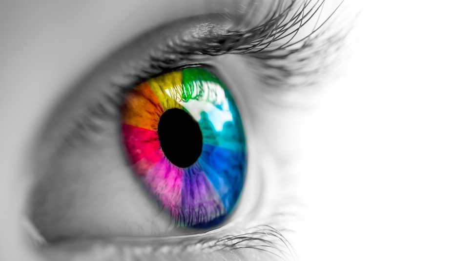
Close your eyes and think of the color red. What feelings come to mind? If you said love or fury, you're not alone.
According to a new study published in the journal Psychological Science, people around the world associate certain colors with the same emotions. Researchers from various institutions, including the Johannes Gutenberg University Mainz in Germany and the University of Lausanne, Switzerland, surveyed 4,598 people from 30 countries across six continents who were asked to assign up to 20 different emotions to 12 different colors. They found that some reactions are universal: Red, for example, is linked to both love and anger around the globe.
The field of color psychology includes plenty of speculation, but there are some widely accepted color-emotion associations that have long been embraced by everyone from advertisers to decorators (including red's link to passion) to elicit positive feelings. Author and color consultant Leatrice Eiseman says that some of those associations appear to be at least partly culturally dependent.
Fun fact
Most people are capable of seeing approximately 1 million colors thanks to the light-sensitive cone cells in our eyes, meaning the reaction you have to a pastel lavender tone could be quite different from the feelings evoked by a deep eggplant purple.
White, for instance, tends to be associated with relief and purity in many Western countries (hence the white wedding dress). But in some parts of Asia white clothing is worn during mourning — which is why study participants in China were more likely to associate it with sadness as well as relief.
Other colors’ more universal emotional associations may be due to the influence of the natural world that surrounds us, says Eiseman, who is the executive director of the Pantone Color Institute and head of the Eiseman Center for Color Information and Training.
She surmises that we begin to form positive feelings about the colors found in nature, like yellow sunlight or a clear blue sky, at a young age.
Wondering how your reactions to popular hues measure up? Here's what Eiseman says about these common hues and the feelings they inspire.
Red
There's a reason people are drawn to a bright red teapot or an eye-catching red dress, Eiseman says. As what she calls nature's “most prevalent fatal color” (think about the color of an open flame or certain poisonous creatures), red tones are linked to pain, violence and danger — but, by extension, to love and excitement as well.



































More on health
Eye Center
Expert information on vision health including cataracts, glaucoma and moreIs Pink Eye a Symptom of COVID-19?
Viruses are among the common causes of conjunctivitis9 Reasons You Should Visit an Eye Doctor
Be sure to schedule routine exams to maintain healthy vision