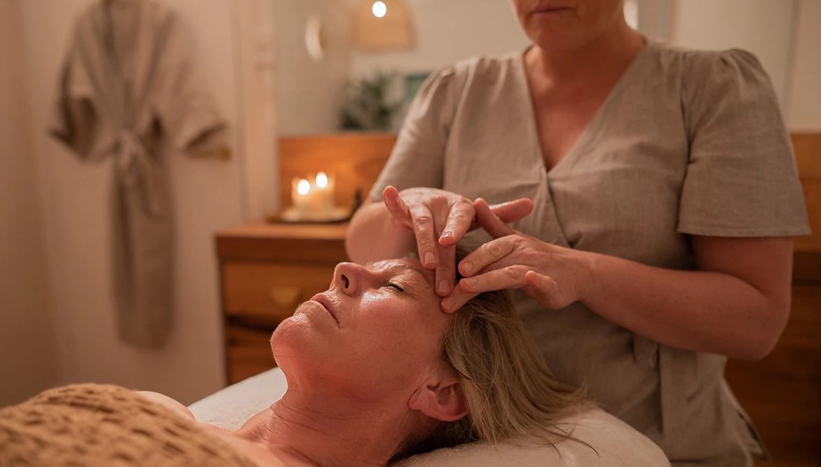
by Dana Chisnell, Amy Lee, and Janice (Ginny) Redish
This year, AARP has been conducting exploratory studies of its own web site to find out how well the site works for its intended audience.
We did the studies in San Francisco, Tampa, and Baltimore. Thirty-four people participated in individual sessions: 15 people in their 50s, 9 in their 60s, and 10 in their 70s. (For more on how we did the studies, see the article, Older Users Help Us Study AARP.org.)
One of the goals of these studies is to develop implications for web designers to consider for their 50+ audiences.
We already have a set of "lessons learned" from studies done by Fidelity Investments' Human Interface Design department with adults over 55.
Different Types of Web Sites; Similar Findings
Fidelity's Human Interface Design group tested prototypes of applications that a company might have for its employees and retirees to deal with their own benefits. Most of the lessons learned by Fidelity hold for our larger and possibly more varied audience.
There were many similarities. For example, our participants also:
- Used a slow, careful strategy for selecting links on pages, and they complained about not having enough time in the session to read things.
- Consistently asked for larger type and less content on pages.
- Often clicked on the wrong things and sometimes missed clicking on things that they should have.
- Were not familiar with web terminology, which prevented them from using parts of the site they might have enjoyed.
- Had physical and cognitive impairments that made using some elements of the web site— especially small links and widgets— difficult to use.
There were a few differences, too, which may be because of the differences in the types of tasks the participants did on the different types of web sites in the two studies.
Specifics: Looking at each of the earlier findings
Each of the eight sections below gives Fidelity's lesson, exactly as it is given there and our findings related to that lesson.
Older adults tend to read most of the text on a page.
Our studies did not focus on reading. They focused on navigation— how participants moved from place to place in the web site— and on performance— how they did tasks like sending a message to a representative or senator. What we observed about how our participants read pages was incidental to our studies.
In our studies of AARP.org, we found some similarities to Fidelity's findings about reading, but also some differences.
Similarities: We observed many older adults scrolling pages in an effort to find the best entry to the next page. Several also expressed frustration that they didn't have time within the session to read text more closely. That makes us think that they would have read more if we had not moved them on to other tasks.
Differences: The participants in our studies often skipped over instructions that might have been helpful to them.
Possible reason for this difference: The purpose of AARP.org is different from the site Fidelity's Human Interface Design group was studying. Their site was about managing benefits, about transactions that carry with them considerable personal risk. While there are some transactions on the AARP site (such as updating membership information), none of them are very risky; AARP.org is much more centered on research and information retrieval in the sense of a general reference. Participants probably would be much less likely to skip instructions on a site or in specific interactions in which their actions involved risk.
Although the sites in Fidelity's studies and in ours have different purposes, we agree with Fidelity's implications about being discriminating with the amount of text on the page, along with following practices such as using clear headings, skimmable bulleted lists, and allowing users to drill from general to specific information. These design features will help older users.
Fidelity's design implications:
- Reduce the amount of text on each page while conveying the required information and not compromising the effectiveness of instructional text.
- Be as concise as possible when providing instructions.
Older users tend to be more cautious in everything they do on the web, including clicking on links.
In our studies of AARP.org, we found a difference among the participants by age. Participants in their later 60s and 70s were less likely to take a risk by clicking to see what would happen than participants in their 50s.
The older participants took a long time to perform tasks compared to what we expected. They tended to look around pages more before taking action. They were less likely than participants in their 50s to choose the first best link. Instead they reviewed all the possible links and then chose from those they felt confident would get them closer to their goal.
Our findings support Fidelity's design implications. These implications also support quicker and more confident navigation for all users, including those who use assistive technology such as screen-readers.
Fidelity's design implications:
- Use action-word links— links that clearly explain what will happen when the user clicks the link.
- The more clear the resulting action for the link, the more likely older users will click it (and the faster they will click it).
Even though it may not significantly improve overall performance, older users prefer larger text.
Our participants repeatedly and consistently indicated a preference for larger text.
We also observed behavior that supports this preference. For example, in a task in which participants looked for volunteer opportunities in their towns, they had to use a long drop-down list to select a volunteering category. The type in the drop-down was significantly smaller than the type elsewhere on the site, and we saw several participants leaning in toward the monitor to see the content of the list.
Thus, our findings support Fidelity's implications for this lesson learned.
Fidelity's design implications:
- Use a "medium-sized" default font.
- Provide an obvious way for older users to increase text size, like a visible button.
- Use "scalable fonts" or fonts that will allow the user to increase and decrease text size using the browser functions (View > Text Size > Larger).
Older users are more likely to click objects that look "clickable", including bullets, headings, etc. and have difficulty clicking small text links.
Some participants thought the top part was clickable, but only GO! is.
We saw many examples of these behaviors. The participants in our studies clicked on headings, labels, and graphics that indicated actions (such as "Contact Congress"), even though these were not links. They clicked on bulleted lists in instructions that listed what could be done on a particular page. They also clicked on numbered steps that were meant to be signposts for where they were in a process.
Some of our participants thought that the steps and the bullets in this sample were clickable— they are not.
Contrary to Fidelity's experience, we also saw participants miss specific opportunities to click links. For example, although the name of a congressional contact was underlined, participants didn't realize the name was clickable. Although a few years ago, it seemed as if web sites had settled on a standard of blue underlined for clickable links, in fact, that has not happened. Lots of sites, AARP.org included, do not use blue underlined for clickable links. Users may, in general, just be confused or assume that they have to figure out each site on its own terms. That means they may make mistakes in both directions.
The underlined name above was a link, but many participants didn't seem to realize that. They did not click the name and were stuck in a dead end as a result.
As Fidelity's findings point out, our participants also had difficulty clicking small text links. Where there were larger text links, participants were more likely to see them and click them. In addition, small text links, especially those that were very close together were difficult for participants to click accurately. They clicked on the wrong link or nothing happened when they clicked because the mouse had moved.
Participants had difficulty with the small links under the pictures, but no difficulty hitting the larger targets on the left.
The Fidelity group also include an implication about redundancy in links. In our studies, some of the participants in a focus group in San Francisco complained about redundant links. However, performance data from the usability tests shows clearly that redundancy in links helped participants. Different participants used different pathways to the same information.
Fidelity's design implications:
- Use an obvious and consistent method of displaying text links, like blue underlining with red on mouseover.
- Use image-based links that provide a larger target area for the user to click.
- Increase redundancy in links (making text AND bullets links) to increase the chances that older users will successfully reach their target.
- In addition, we suggest that redundant links be clearly redundant. Wording should reflect the specific task, and the same or similar wording should be used in all links that lead to the same task goal. [An AARP extension of this implication: Redundant links should be clear so that users do not have to think about whether two links do different tasks or go to different places.]
Numerous experiential differences contribute to older users' overall level of confidence and anxiety in using the web.
Fidelity's lesson comes from working with adults over 55 compared to those younger than 55. In reporting this lesson, the Fidelity group did not distinguish different age groups within their over 55 participants. Fidelity found that their over 55s were cautious, and their design implication focuses on being careful about implementing changes for cautious older users.
Fidelity may have seen that all their users were cautious, in part, because of the nature of the tasks at a Fidelity Investments site, tasks that can have serious financial consequences if done incorrectly. Users probably visit AARP.org less frequently than they would visit a benefits site, and they probably visit for different reasons. With the much less risky situations at AARP.org, we did find differences by age among our participants.
Our participants in their 50s had different expectations of ease-of-use of web sites than our participants in their 60s and 70s. Participants in their 50s made suggestions about making the web site easier for them to use, while many of the oldest participants said they would simply have to spend more time with the site to understand better how to use it.
Users may be more cautious in interactions in which they think they might be committing to something or where there may be long-term implications, such as making a purchase online that might be difficult to cancel. If your site— or part of your site— draws frequent older users, consider changing the design slowly over a longer period. Start with subtle changes, if possible. If it isnít possible to be subtle, try to warn frequent users that change is coming, and give them opportunities to preview and learn the changes before they are put into production.
Fidelity's design implications:
- Keep your design simple and stable. Too many changes in the design over a short period of time will force the older users to re-learn how to work with the site. The more success older users experience with a particular site, the higher their confidence level will become, and the lower their overall anxiety.
Older users often do not understand terms that younger users consider common knowledge.
When people start to use the web, they meet many new terms. Fidelity found that many adults over 55 are not sure what terms like "link," "URL", "login", and many other "web words" mean.
We, too, found many examples of web words that did not make immediate sense to our participants. Many were unclear about the meanings of "online community" and "message boards." "Browsing" wasn't always meaningful in the context of a feature called "browse by topic." The word "emoticon" and the concept behind it were completely foreign to most of our participants. A link on the AARP Magazine's web site labeled "Visit AARP.org" takes visitors to the main AARP site, but many participants thought that link would lead them to information about AARP rather than to the main page of AARP.org. A few participants expected the "site map" to show the geographic location of AARP's offices.
Thus, our findings support Fidelity's implications.
Fidelity's design implications:
- Do not use web or other technology-related terms without defining them. Some of these terms include Back (or go Back), link (click the link), URL, menu bar, toolbar, IM, minimize, Login, and home.
- Keep terminology as simple as possible throughout your site.
As people age, they have an increased likelihood of disabilities, including visual (myopia, cataracts, etc.), fine motor (tremors in hands), muscular/skeletal (bone disease like arthritis), and cognitive (short-term memory decreases).
Most of the adults in our studies wore glasses and many had special glasses to wear when using a computer. Ease of movement often seemed to be an issue, even for participants who had no tremors. Some of our participants had short-term memory loss, attention deficit disorder, or were taking medication that affected their cognitive ability. Several participants had combinations of these issues, such as having to wear bifocals and having reduced fine motor skills. The combination impaired their hand-eye coordination and made hitting small targets extremely difficult. Thus, our findings support Fidelity's.
Fidelity's design implication:
- Review the W3C's Web Content Accessibility Guidelines. This provides recommendations for supporting assistive technologies and designing for users with disabilities.
Older users have difficulty working with pages that are dense or have too much detail.
"Busy" pages were a subject of frequent comments from our participants; the only more frequent comments were about the need for large type. On some pages, participants said they werenít sure where to look on the page. We heard this in comments about the home page and also about second-level pages. So, again, our findings support Fidelity's implications.
Fidelity's design implications:
- Keep pages as simple as possible so that older users do not encounter "information overload."
- Provide concise instructional text and break information up into separate pages if necessary, so that no one page presents too much information or requires users to remember too much.
In summary: Our usability studies in 2003 confirmed much of what the Fidelity group found. The implications from these findings would be good to consider for any site that has users over 50, especially those with users in their 60s and older. We welcome your insights from your studies. Join us in discussing them at our Older Wiser Wired message board.
